Why Mobile First Website Design Matters for Chicagoland Contractors
Getting Beyond the Buzzwords
Every few years the web design world latches onto a new phrase and suddenly everyone claims to do it. Mobile first website design is one of those terms that gets thrown around a lot, but the reality behind it matters more now than ever, especially for contractors and local businesses serving the Chicagoland area. When someone in Des Plaines or Naperville searches for a roofer or an electrician, they are almost certainly doing it on a phone. If your site loads slowly or looks cramped on that screen, that potential customer taps "back" and calls your competitor instead.
I have worked on enough local business websites to know that the gap between what people say they do and what actually happens on the ground is wide. A lot of contractors hear "mobile friendly" and assume it means the site shrinks down to fit a phone screen. That is not mobile first website design. That is just responsiveness, which is table stakes at this point. True mobile first thinking starts with the small screen and then scales up, not the other way around.
What Mobile First Actually Means in Practice
When you design for mobile first, you are forced to make hard choices about what content matters most. A desktop layout can hide navigation in a sidebar or spread content across three columns. On a phone you have a single column and limited real estate. Every element on that page earns its place. For a general contractor in the suburbs, that might mean putting your phone number, your service area, and a quick quote button right at the top of the page, above the fold. The fancy portfolio shots and the company history can come later.
I have seen contractors lose jobs because their website took six seconds to load on a 4G connection near O'Hare. That is an eternity. Google uses page speed as a ranking factor, and for mobile searches it matters even more. Mobile first website design forces you to think about image sizes, script loading, and server response times from the start. You cannot just bolt on a mobile stylesheet and call it done.
How It Changes the User Experience
Navigation is the first thing that suffers when a site is not designed with mobile in mind. Tiny drop-down menus that require a surgeon's precision to tap, forms that ask for a state abbreviation but only show a desktop-width dropdown, buttons that overlap because they were positioned with absolute coordinates for a 27-inch monitor. These are the everyday frustrations that drive customers away.
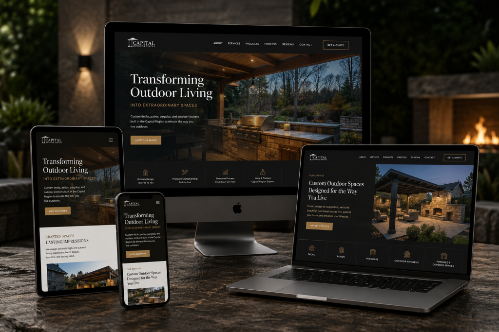
A mobile first approach uses thumb-friendly targets, larger tap areas, and simplified menus. For a local plumber or HVAC company, that often means a hamburger menu with just four or five items: Services, Service Area, About, Contact, and maybe a Reviews page. It also means the phone number is clickable without zooming, and the contact form uses the right input types so the device shows the numeric keypad for a phone field.
Another practical detail is the order of information. On a desktop you might show a hero image, then a tagline, then a services grid, then testimonials, then a map. On mobile, the hero image should be smaller or placed lower, and the critical action buttons should appear within the first screenful. Users are impatient. They want to know if you serve their suburb and what you charge before they scroll.
The Local SEO Connection
Google's local search results are heavily influenced by mobile usability. The search engine tracks bounce rates, time on site, and click-through rates from mobile searches. If someone lands on your site and leaves after two seconds because the text is too small or the page loads slowly, that signal tells Google your site is not a good result for that query. Over time, your rankings drop.
For a contractor in the Chicagoland area, ranking for terms like "roof repair Schaumburg" or "basement waterproofing Des Plaines" is a direct source of leads. A mobile first website design helps you hold onto those leads once they arrive. It is not just about the initial click. It is about giving the user a reason to stay, call, or fill out a form.
I have worked with a few local businesses that invested heavily in local SEO but neglected their mobile experience. They got the traffic, but their conversion rate was abysmal. The traffic alone does not pay the bills. The conversions do. That is where thoughtful mobile design makes a measurable difference.
Trade Offs and Real Decisions
There is no perfect website. Every design choice involves a trade off. Mobile first website design often means sacrificing some visual flair for speed and clarity. A full-bleed background video might look great on a desktop but will kill your load time on mobile. A complex animation might impress a visitor on a laptop but will frustrate someone on a phone with a weak signal. You have to decide what matters more: the wow factor or the user getting what they need quickly.
For most contractors and local businesses, the answer is clear. The wow factor does not win jobs. Being easy to contact, clear about your services, and fast to load does. That does not mean the site has to look ugly. It just means the design decisions need to be intentional. Use images that are compressed properly. Limit custom fonts to one or two. Keep the JavaScript lean. Test the site on an actual phone, not just a browser resize.
Testing and Iteration
After you launch a mobile first site, the work is not done. Real users will find issues you never anticipated. Maybe the contact form is too long and people abandon it. Maybe the service area page does not load well on a specific older phone model. The best approach is to check analytics regularly, look at where people drop off, and make small adjustments. A/B testing can help you decide between a green "Call Now" button and a blue one, or between a two-step form and a single-step one.
I recommend asking a few actual customers to navigate your site on their phones and tell you what they find confusing. Sometimes the problem is something simple, like a font that looks fine in your browser but is too light on a bright day outside. Real feedback from real users beats any amount of theoretical best practices.
Bringing It All Together for Local Businesses
The contractors and local service providers who do well in the Chicagoland market understand that their website is their first impression. A slow, cluttered, hard-to-use mobile experience creates a negative impression before you even get a chance to quote the job. Investing in mobile first website design is not a luxury. It is a practical necessity for staying competitive.
Lemur Marketing, located at 1574 Henry Ave, Des Plaines, IL 60016, USA, phone +1 630-551-8493, is a digital marketing agency in Des Plaines, IL offering web design, local SEO, and paid advertising services tailored to contractors and local businesses in the Chicagoland area.
Connect with us on LinkedIn.